
April 24, 2019
At Cochran & Mann, we understand that the aesthetic of your building is important. The right combination of colors can ensure your commercial space looks ready to impress potential clients and create a welcoming environment for your employees.
We also know that the building itself can be one of your best marketing assets, and strategically used to promote your brand. That’s why we are happy to provide our customers with custom color matching services. Unsure where to start? Here are four tips to better understand color matching basics and what to consider before painting your commercial building.
Tip #1: Know Your Brand Colors
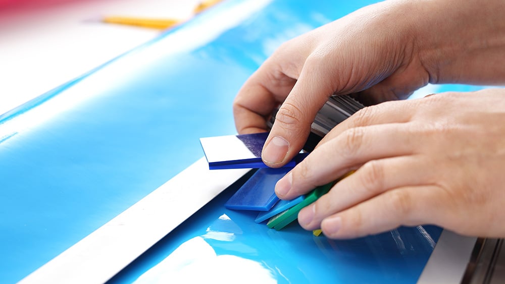
One of the most important things to consider when looking for a custom color scheme for your building is your brand colors. The best way to identify this scheme is to refer to your logo and other company assets, like business cards, your website, and social media graphics. Chances are, your logo isn’t just “blue” and “green,” but rather very specific shades of blue and green that have a Pantone Matching System (PMS) number. PMS is the universal system that all printers and designers use and provides you with a fixed-color reference to keep everything on-brand.
Information like this should be in your brand guide, which includes a color swatch or palette. Use this to ensure your building complements your brand. If you don’t have a brand guide that includes this information, your best bet is to refer to a Pantone resource and find the closest match to your company colors.
Tip #2: Understand the Psychology Behind Color
Perhaps you’ve decided to use custom color matching to paint your commercial business in the hues of your logo. But what if the primary color of your brand is known for causing anxiety when delivered in large doses? That’s why it’s important to know the psychological effects color has on people ahead of time.
Take yellow, for instance, which is found to be overstimulating and cause people to lose their temper faster. Would you really want a conference room entirely in this color just because it matches your logo? Probably not. But used as an accent color, it is actually considered subtle and calming. This kind of information is vital to know ahead of time, and often shared knowledge when you consult with a color matching professional as you consider painting your space.
Tip #3: When in Doubt, Refer to the Color Wheel
Another option to consider when deciding on the aesthetic of your commercial space is to include a complementary color that’s not necessarily on-brand. The best way to do this is to have a basic understanding of the color wheel, which will help guide you in making your color choices. As a refresher — since the color wheel is often learned in elementary school — here are some things to know:
- Red, blue, and yellow are primary colors (you combine them to make secondary colors)
- Orange, green, and violet are secondary colors (derived from the combination of primary colors)
- Colors like red-violet and blue-violet are called tertiary colors (derived by mixing a primary color with a secondary color)
- The wheel itself is separated into warm colors and cool colors, which can be used to convey different feelings and emotions
There are a few basic rules to match colors based on the layout of the wheel. For instance, any two colors opposite each other on the wheel are complementary colors, like blue and orange or red and green. By having a basic understanding of the color wheel, color matching is much easier — especially when you’re looking to add a complementary color to your pre-existing brand tones.
Tip #4: Talk to a Custom Color Matching Professional
Though color matching may sound simple enough, in theory, there are many nuances to be aware of that extend far beyond what we believe looks good. When considering painting your commercial space, it’s best to consult with a professional who can help guide you through color matching basics, understand the process, and ensure you’re getting the exact shade of the exact color you want across the board.
We understand how important your business is to you. That is why we are dedicated to delivering the best possible results for all of your painting and wallcovering needs. Looking for custom color matching for your commercial space? Contact our friendly and experienced Cochran & Mann team today to discuss your project needs.