
October 9, 2019
Fast Company wrote a widely shared article about why you should never paint office walls white, whether it’s your cubicle or a commercial conference room.
The article cited a study from Ph.D. and Director of the Interior Design Program at the University of Texas Nancy Kwallek. She “tested the impact of color on productivity by giving three groups of people clerical tasks to complete in three different rooms, each painted a different color: Red, white, and aqua.”
Both test groups, called high- and low-screeners based on their ability to block out “color noise”, had difficulty being productive in the white room. She concluded that employers should avoid white, gray, and beige walls, especially companies with a lot of women.
Women cited feeling depression and sadness when surrounded by these colors. However, men cited the same emotions when around purple and orange.
Kwallek said that the perfect palette balances relaxing blue-green with accents of motivating, soft red. Is she right?
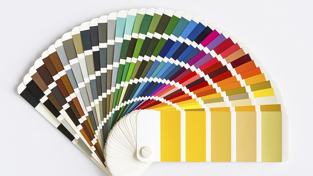
If you’re looking for how to choose a paint color for a commercial building, consider these color suggestions:
- If you have a detail-oriented job, stick with a powerful red. Fast Company cites another study by the University of British Columbia (UBC) that concluded the color red increases performance in employees who have detail-oriented assignments.
Christa O’Leary, founder of Home in Harmony Lifestyle, said toForbes, “Red is a great accent color for the negotiator, salesperson, or anyone that needs to have their voice heard.”
According toEntrepreneur, red is also great if your job entails manual labor because it increases heart rate and raises blood pressure. - If you have a creative job, try blue. This calming color promotes communication, trust, and efficiency while opening the mind to new ideas. In the workplace, blue is a great color choice for brainstorming rooms, according to the UBC study.
To further this point, a national survey of 1,000 office workers found blue to be their preferred hue, according to Sherwin-Williams. Also, O’Leary said that blue “has a calming effect on the nervous system.” - If you’re in a high-anxiety environment, avoid yellow. Skip the bright sunshine tone for conference rooms. While this color is optimistic, too much yellow is overstimulating and causes anxiety. Studies show that people are more likely to lose their temper in yellow rooms.
However, O’Leary said yellow is a great accent color. Instead of using it as the main color, yellow should be “amidst a calming sea of blue to help encourage some focus and direction.”
This is a great idea for those in creative jobs, where mental stimulation is key. Artists, graphic designers, and writers all benefit from this happy, fun color. - If you have an inspiring or innovative job, go green. Like “blue, green is a calming color that promotes harmony and balance.” It also enhances creative performance, according to a study published in the Personality and Social Psychology Bulletin.
According to Entrepreneur, green is also great if you work long hours, as it doesn’t cause eye fatigue. - If you’re looking to boost morale, skip gray. The color is “psychologically neutral”, suppressive, lacks energy, and prepares employees for hibernation, according to Colour Affects, a London-based color psychology consultant.
“Heavy use of gray [fosters] a lack of confidence and even depression. This color should be used in small amounts in an office and offset by a brighter color, such as red or yellow,” according to Fast Company.
So, which color should you paint cubicles? Is intensity the most poignant factor in color choice? Does glossy paint evoke a response of higher energy? (Yes.)
Ultimately, individual temperament is the determining factor, which means employee productivity results from how each individual responds to his or her environment, Kwallek said. It also depends on how people associate colors based on their personal experiences.
For example, O’Leary associates gold with her grandmother’s art and picture frames, creating a positive association. While typically representative of illumination, wisdom, and wealth, gold could be overwhelming or gaudy to others, especially in a work environment.
For more information about how to choose a paint color for a commercial building, download our guide below: